Wednesday 30 November 2016

Visual Identity - Brief

Visual Identity

Briefing 30-11-2016
Final Crit 13-12-2016 
Unit Deadline 17-02-2017

To design an eye-catching visual identity for an existing small local business.

Requirements
An identity which can be applied to at least 5 relevant items which demonstrate the success of your solution(s).
Back up work in the form of research, multiple idea generation and development of your solution.

Context
A strong visual identity is the most important consideration of any organisation, in order to make their brand successful. This tells everyone who you are and what you do. The identity is an essential part of the brand and needs to be simple, memorable, distinct, relevant, engaging and interesting.

The Challenge
During this project, you will design a unique, eye-catching visual identity taking into account all relevant aspects such as signage, packaging, livery, stationery.
This project is designed to enable you to gain an understanding of what creating a visual identity for a brand involves and to recognise the importance of relevant ideas generation and research on a theme in order to come up with individual, eye-catching solutions.
You will be provided with the subject for your identity.

The Audience
The audience will be speci c to the subject matter.

Things to Consider
Visual Identity is the visible part of a brand. It may incorporate a logo, or it may use other devices to make it recognisable.
Successful brands do not start with a logo. They are about meaning which is shared, powerful and positive eg John Lewis: “never knowingly undersold”. Brands must be:
• Authentic (true to themselves) – they don’t lie
• Distinctive
• Compelling – facts are boring, stories are good

Research thoroughly your chosen subject. Ensure you understand the following:
• organisation background: history, origins
• market: what type of person is/could the organisation be aiming at

• brand bene ts: what does/will the brand give to the consumer • brand personality: characteristics of the brand

You may need to reinvent the brand and imagine it as a larger organisation. Analyse your chosen brand and show your ndings in your research. During the research stage it is helpful to nd or create a story for your brand, or to nd the USP (unique selling point).

Generate multiple creative ideas, which work across a wide range of applications and show an understanding of speci c requirements and restrictions relevant to the brand, when applying your identity.
Applications you may consider are main sign, web site home page, app design, menu, carrier bag, ticket, Tee shirt, vehicle livery, car sticker, business card, letterhead, signage. There may be others, which will be speci c to your subject.

Reference material
Wiedemann, J., (2009) Brand Identity Now! Taschen
Davis, M., (2009) The Fundamentals of Branding Ava Academia 
Wheeler, A., (2009) Designing Brand Identity John Wiley and Sons 
McAlhone, B., Stuart, D., A Smile in the Mind Phaidon 

Monday 14 November 2016

NUA Norwegian Christmas Market - Finished Products

These are the final products I made to sell on the Christmas Market. I really enjoyed doing something different and getting back to doing craft work. Unfortunately the market wasn't as successful as everyone had hoped and only one of my cards sold. Hopefully next year there will be more interest and more people will know that market is open. 


Tuesday 8 November 2016

D&AD Visit - History of D&AD

D&AD came you Norwich University of the Arts to hold talks for second and third years on graphic design. The talk for second years was held in the morning, they explained their history and how the award programme worked.

We heard how D&AD started in 1962 as a group of designers are artists who wanted praise the excellent within the creative fields. It is now one of the biggest art and design organisations in the world with 27 different categories and five different award pencil.

Yellow pencil - The award everyone is seeking and the first award D&AD held
Black pencil - Though who get Yellow pencils get can have the chance of getting a Black pencil. There is not certain number that have to be handed out, so if you get one your work is really special.
White pencil - Created for their 50th anniversary, it is there for amazing work created for non-profit.

D&AD as hold a New Blood awards programme for new talent entering the industries. This is primarily what they came to talk to us about. There is a two week boot camp of talks and live briefs to help people get into the industry. They also hold a New Blood Exhibition, which I attended last year where students get to show off their work to pencil employees and other creative people. There are also workshops and taster days held at this time.


Thursday 3 November 2016

Editorial Workshop

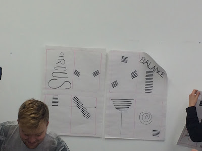
We had a workshop to introduce the Editorial brief where we worked in groups to draw quick sketches that represented the given themes. My group worked on the weather theme where we thought about map, weather scales and how the text could show the movement of the wind or rain. I also took a photo of another groups example of the circus theme where they thought about how objects balance and move around the arena.

The editorial needs to be creatively inspired by the subject matter in terms of format, grids, layout and typography. So if all the photos and images were taken away the subject matter would still be clear. 


Wednesday 2 November 2016

Editorial - Brief

Norwich University of the Arts 
BA(hons) Graphic Design
Unit BA2a: Experimentation & Application


Editorial
Brieing 02-11-2016
Final Crit 29-11-2016 Unit Deadline 17-02-2017

Design pages for a publication, which are creatively inspired by the subject matter in terms of format, grids, layout and typography.

Requirements
You must include back up work in the form of research, multiple idea generation and development of your solution.
Your editorial must consist of
a cover and at least 2 double page spreads or 3 double page spreads


Context
This project will enable you to gain an understanding of working with grids and type layout and to organise information with logic, in order to create lively creative layouts, which still have strong ideas for its basis.
It’s important to note that most of the editorials you see around you have very standard/template grids, which mean that there is little to distinguish one from another and consequently they can be very uninviting to look at/read. This project is designed to focus your creativity on challenging this “norm”, in order to create eye-catching outcomes which are uniquely relevant to the subject matter.

The Challenge
You are asked to design an editorial,l based on given subject matter for which text will be supplied.
The project will begin with a workshop, which will help you explore the nature of “The Creative Grid”

The Audience
The audience will be speci c to the subject matter.

Things to Consider
The title of the article should give you your inspiration for your idea. This will be your theme.
You should approach this project either by considering one overall format/ idea for the whole publication.
Both your grid and type could be in uenced by the theme. A grid shouldn’t be restrictive, it should help you. Grids can in fact be inspired by your subject matter, as will be demonstrated through the workshop.
Imagery is only a secondary consideration for this project. You can use found imagery or take your own photos but must only use these elements to support your type/grid inspired idea. You could decide to use no imagery within your design with consideration of the idea of type as image
It’s important that you thoroughly consider hierarchies. This is the process by which you identify parts of your text which need to be given more or less importance e.g. headings and general text, quotes and captions.


Requirement
Your nal outcome could be made up into a dummy booklet, but this is not essential. It can be presented as professionally presented spreads, trimmed to size and at full scale.
Use the appropriate software for the job, in this case, InDesign. Illustrator and Photoshop are not appropriate for text and image layout. As a professional working within the industry, you will be expected to have an understanding of all software and to use appropriately depending on what you are designing.

Reference material
Online
http://www.thedrum.com/news/2012/11/01/changing-role-challenger- brand-innocent-brewdog-and-tyrrells https://contently.com/strategist/2014/12/05/how-airbnb-is-using-content- marketing-to-stay-on-top/ http://www.cmo.com/features/articles/2013/12/3/rise_of_the_challeng. html#gs.kjS_EcA
The Dieline www.thedieline.com/
Lovely Package http://lovelypackage.com/


Libary
Kirkpatrick, J., (2009) New Packaging Design, London, Laurence King Boylston, S., (2009) Designing Sustainable Packaging, London, Laurence King
Edwards, Klimchuk, Wallace, Werner, (2009) Really Good Packaging, Rockport

Olins, W., (2004) On Brand. London, Thames and Hudson Wiedemann, J., (2009) Brand Identity Now! Taschen
Davis, M., (2009) The Fundamentals of Branding, Ava Academia Wheeler, A., (2009) Designing Brand Identity John Wiley and Sons. 

Wednesday 12 October 2016

Packaging (Heaven) - Brief

Student Brief – Innovative Packaging
Context to the brief: Personal care products and skin care range – body creams plus toiletry products.
Heaven is a premium skincare range of body creams and bath products that is made using botanical ingredients, essential oils and has no added perfumes, colours or preservatives.
Launched to capitalise on the trend for local, artisan made goods with health and well-being benefits the product uses a 10 responsibly sourced, simple high quality materials and naturally occurring ingredients. Sustainability values are a big feature for this luxurious product and this should be reflected in the packaging design.
Aim: To conceptualise and produce the packaging of a new personal care skincare brand. The focus of the product range is all about carefully selected ingredients and essential oils that allow customers to be elevated to a better sense of well-being.
Students are encouraged to reflect the qualities of the product (body cream and bath range), the name, the sustainability values, small-batch production and the ingredient choices when designing the packaging. You can invent your own packaging solution or use an existing format with modifications, depending on what is most suitable.
Considerations:
·       Small batch production of body creams and personal care bath products - opportunities for versioning and personalisation
·       The unique selling points of ‘Heaven’ skincare
·       How does this new brand compare with the competition?
·       The packaging will be made from Invercote - a smooth, high performance sustainably produced paperboard brand known for its flexibility, dimensional stability, and printability.
·       Repeated folding capability with Invercote G around 2,700 + times possible
·       Can the packaging tell the product’s story?
·       Sustainability messages/values regarding ingredients and packaging materials

Audience: Ethical consumers who advocate high quality, premium products - these consumers (not gender specific) are the audience for the range.
Quantity: Batch produced, small runs with print on demand digitally produced packs.
Requirements: Produce a visual mock-up 3d pack using the Invercote material provided.
4 x A3 boards to present your solution.

Provide a clear rationale on one A4 side to justify your decisions.

Tuesday 11 October 2016

Visual Connections - Final Crit


This was the idea I come to the final crit with, I still wasn't happy with how it looked but I thought the idea might be in there.

  • Bricks out of scale - not needed
  • Too many spirals on notepad and no other side to them 
  • Fixture could be more ornate? 
  • Could include other language such as a red margin line or a pen or pencil in the spirals
  • Could have a second poster as a stand to carry theme through 
  • Hand drawn text is need for title
So I went away and changed things so it then looked like this: 
This still doesn't have the wow factor even though I like the idea. I decided to leave this project for the time being and come back to it when I had my next holiday from uni. 


* UPDATE* 
Mid Unit Review

In my mid unit review Helen looked through my back up work and said I had a stronger idea in there. So I went back and tried to combine a pencil top with a pint. I had previously tried to create a drawing where the two combined but it didn't work very well and was hard to distinguish what it was meant to be. 


I moved away from the illustrated style and choose to photograph the two. This is the final poster I came up with. I am still not happy with the image quality but I think the idea is a lot stronger and shines through more. 


Friday 7 October 2016

NUA Norwegian Christmas Market

This year the Student Union is holding a stall on the Norwegian Christmas Market outside the Forum in Norwich. We were given the opportunity to make Christmas decorations and cards to sell. All profits would come back to the students and 10% to the SU.

I went to the first meeting to discuss what we could sell and what the stall would look like. I think I am going to make some cards and some baubles. I will have to go have a look around hobbycraft!


Wednesday 5 October 2016

Storehouse Meeting


I decided to join the team that create the university's magazine, Storehouse. This is a student lead and SU funded magazine that is printed and distributed around NUA. It includes interviews from local companies and from creatives working in industry.

Twice a year we ask students to send in submissions to be included in the magazine. I was featured in Storehouse in my foundation year.

This issue is called 13 as it is the 13th copy of Storehouse and will be released around October time. The theme is spooky and Halloween.

I have found it hard to participate on his issue as the team has been spread about the country over the summer holidays. Then the week everything came together I was on holiday and unable to give my full attention.

I am looking forward to the next issue where hopefully we will have proper meetings and it will be more organised.

Tuesday 4 October 2016

Visual Connections - Intermediate Crit

In my first crit for this project I was told to stop being so neat with my work. I need to do more sketches and layout designs. I need to go away and look at illustrative techniques and styles to help me with my final poster.

I was also told to look at existing graphic posters from places such as D&AD and design books.

The idea is key, not how busy the poster looks, I need to remember this.

Monday 3 October 2016

Contextual Research Brief


Norwich University of the Arts

Graphic Communication, Graphic Design, Design for Publishing, Year 2

Term 1: BA2a
Project: 3,000 Report
Dates: Hand in: Friday February
17, 2017

Project title
3,000-word Report (made up of a 2,000-word essay and a 1,000-word annotated bibliography)

The brief in a sentence
The 3,000-word report will analyse a specific aspect of graphic design history in relation to key design issues. (The report will be in two parts: a 2,000-word essay and a 1,000-word annotated bibliography)

Background/context
Your research for your 3,000-word report will give you an opportunity to thoroughly investigate relevant ideas, designers, movements, issues and debates (both historical and contemporary), including those relating to ethical matters, while developing lines of inquiry and critical thought.

The challenge
With the support of your tutors you will independently devise a thesis question that will guide your research. The report should relate to your studio practice. The research should provide a foundation for your studio projects. The report must have a coherent theme and the sections need to relate to each other.

Audience
The report is aimed at a person who has no prior knowledge of your topic, but expects clear and logically structured information that is effectively communicated.

Things to consider
The report should make use of the most recent and most authoritative research on the subject. This research must be evaluated, analysed and communicated in a clear and concise manner. Academic writing skills will be developed and supported through the composition of your 3,000-word written text for which you will independently research, analyse and present your findings.

Assessment requirements
The 3,000-word report must be professionally presented. It must include all the standard requirements of an academic essay, including your name, title, referencing and a bibliography. Images must be numbered, captioned and be discussed in the text. Harvard referencing must be used in the body of the report (e.g. after quotes or other research) and in the bibliography. 

Monday 26 September 2016

Visual Connections - Brief

BA (Hons) Graphic Design

Year 2
BA2a. Experimentation & Application

Briefing: 26.09.16
Final Crit: 11.10.16
Unit submission: 17.02.17

VISUAL CONNECTIONS

The brief in a sentence
Design a poster that visually connects 2 relevant themes.

Background/context
Graphic Designers often solve problems by lateral thinking, using references to and associations with subjects, in order to communicate the subject in a less obvious, more sophisticated way. References can be clever, witty, subtle, sly, unpredictable and therefore memorable when used alongside the subject. There are obvious examples (a clapper board to say film) but these tend to end up as graphic clichés.
Collecting associations/references can help with understanding a subject in depth and allow an element of selectivity in working towards a solution. Equally a collection of associations can be the answer to a problem.
There are two main aims of this assignment, which both relate to laying the foundations of a good design process:
·       Understanding what researching a subject really entails.
·       Understanding an approach, which can help you come up with innovative ideas.

The challenge
Design an imaginative poster for a given event/exhibition.
Each event comprises two themes that combine or adapt to give an entertaining subject to publicise e.g. Jazz by Candlelight, Horror Film Festival, Rural England, etc.
Research your themes separately, making full use of the libraries, magazines, book shop browsing, other more specialist environments related to your subject e.g. Norwich City Football Club for football, Travel Agents for tourism, Museums, shops and malls for Shopping, charity websites.
Your early visuals must include/be based on collecting as many VISUAL ASSOCIATIONS as possible – your subject will need to be thoroughly researched to ensure this happens.
You will be expected to show this research at the first interim crit.

Audience
The audience will depend on the nature of event and it is for you to decide whom this is most appropriate to. You may decide you should aim your message to everyone, or it may be quite specific whom you’re targeting.


Things to consider
You should find this way of working liberating. It helps avoid formulaic approaches to problems.  Final solutions will be less obvious, more imaginative, surprising, humorous or make the viewer think.
It’s important that you don’t get too fixed on a final outcome, too early. You should enjoy the journey of researching and generating ideas. You need to fully immerse yourself in your subject(s).
“I start by going out there and observing the subject of the brief, wrapping myself in the environment for example with the beer brief we sat in the pub (perks of the job). It helps you learn more about what you’re designing for and the people, mood, sound, shapes etc all these can spring ideas, then narrow the idea’s down to what fits the product most naturally.
Interview for Gola with NUA graduate Jason Drake.
http://www.gola.co.uk/borninbritain/jason-drake-artwork/#.UjLbtA56WjQ.twitter

Your final poster must be at least A2 in size. It can be colour or black and white. For the final crit it you can be tiled from A4 or A3 printouts, to the appropriate size.
It must include the following information:
         Title
         Subtitle/explanation of event (if necessary)
         Venue
         Dates
         Times
         Prices (if relevant)
         Contact phone number (if relevant)
         Website address


Reference material

Bergström, B., (2008) Essentials of Visual Communication, London, Laurence King
Stoklossa, U., (2007) Advertising – New Techniques for Visual SeductionLondon, Thames & Hudson
Ambrose, G., Harris, P., (2010) Basic Design 08 Design Thinking, London, AVA Academia                     
Ingledew, J., (2011) The A-Z of Visual Ideas, London, Laurence King